Creating a Logo That Feels Like Us.
When we decided it was time for a new logo for the Beverly Heights Community League, we knew we wanted to do more than give our visual identity a fresh look.
We wanted something that better represented the character of Beverly Heights—the places, memories, and qualities that make this neighbourhood feel like home.
It started with you
We polled our members about the images they felt best represented Beverly Heights. We also looked to social media, searching through positive posts and conversations about what people love about the neighbourhood and what they feel brings something special to this part of Edmonton.
What emerged was a collection of ideas that went beyond buildings and landmarks. They spoke to the feeling of the place.
Three themes in particular stood out: the river valley, our beautiful tree-lined streets, and the fond memories people have of growing up here.
And from those ideas, the new logo began to take shape.
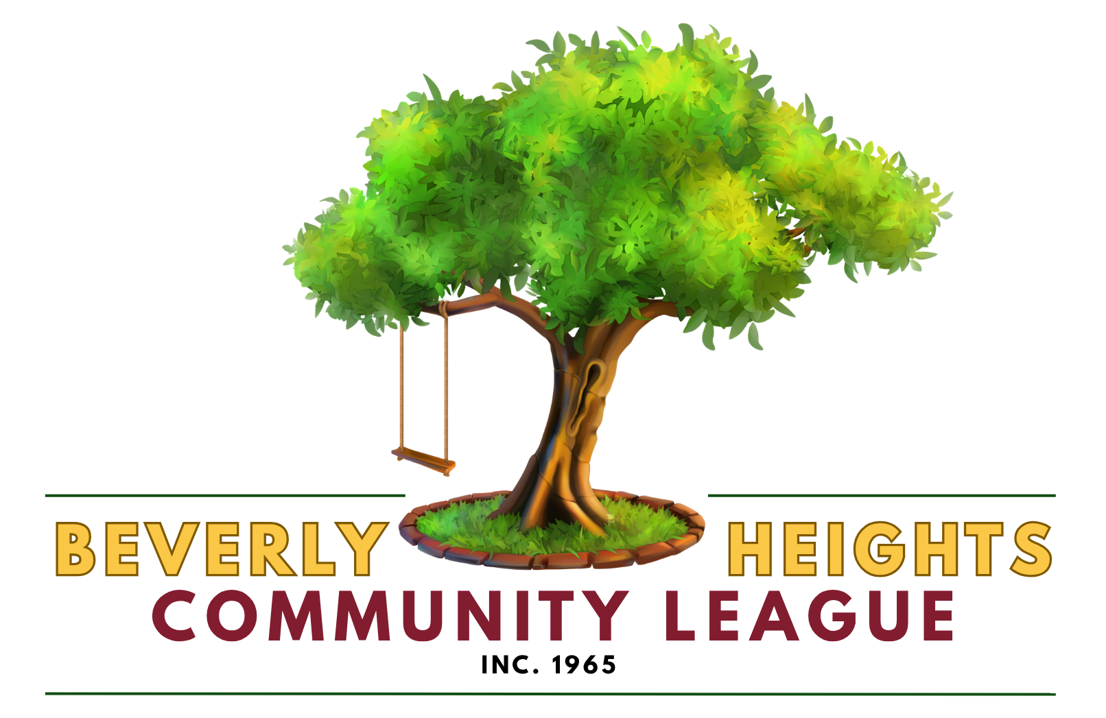
The Swing
The Swing (and you all know which one I'm talking about!) is a particularly meaningful part of the area's identity. In our new logo, it represents our proximity to the river valley, but it also evokes something more personal: nostalgia.
A swing is playful and welcoming and reminds us that community leagues aren't defined solely by bylaws and board meetings—they're defined by the memories people make in these spaces alongside us.
The Tree
The Tree represents another defining feature the league's setting: Floden Park and Beverly's green canopy of mature trees.
The mature trees throughout the neighbourhood contribute so much to its character. They create shade, beauty, and a feeling of permanence.
The tree in the logo brings that quality to life. Its broad canopy suggests a community league that is established, connected, and growing, while its strong roots speak to the intricate connection between the league, our members, and our land's history.
Keeping a connection to our history
While the imagery is new, we didn't want the logo to lose its connection to who we've been.
That's why we retained BHCL's legacy burgundy and gold colours in the lettering. We wanted to connect the community league's history to the area as it is today.
The result is something that feels both familiar and new. We hope that when you see the new logo, you recognize a little bit of yourselves in it.